Since the peak in yields in October 2023 I have followed the 2007 analog for yields with an almost "Religious fervour" and I think it has served me well.
I have also noted on occasion that these analogs should be respected as long as the price action and backdrop today continues to track with the historical period. Things and catalysts do not need to be the same but they do need to "rhyme"
Clearly, we have events today - particularly Geopolitical and Political that have become increasingly important to markets which did not exist in 2007. At the same time, we do not have a housing crisis and a blow up in mortgage-backed securities like we saw then .
We do have some employment concerns but that is not necessarily comparable only to 2007.
Finally, one of the BIG differences has become the level of fiscal irresponsibility on both sides of the isle that now sees a National debt at $35.8 trillion (compared to about $9 trillion in 2007) which is $106k per citizen and $272k per taxpayer and a debt to GDP of 122% in a high interest rate environment.
With no fiscal responsibility we continue issue more debt and the Fed continues to shrink its balance sheet (which results in further realised losses and therefore no remittances back to the Treasury anytime soon)
With all this in mind it is still the price action in markets that I revert to and often in this respect it is a different market that flashes the warning signs.
In that respect it is the 30-year yield chart and the 2's 30's curve that are giving me reasons for concern at this point and inclining me to part ways with the 2007 analog.
I need to emphasise that this is an EARLY WARNING SIGN and we still have some work to do for this to come to full fruition. Notwithstanding that the picture is on the edge of concerning.
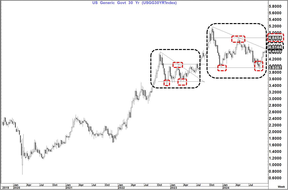
I mentioned in the piece earlier today Snippets To Start The Week that the 30 year was breaking higher and had a measured move target of a move to 4.55%
That would constitute a low to high move of well in excess of 100 bp's which is materially larger than the bounce in Sept 2007 (which was only 36 basis points) This is a sharper divergence than seen on the 2-year yield that has bounced 59 bp's compared to 48 back then. That is more tied to the path of the Fed and as long as they are still guiding to two more 25's this year that will still be the main driver.
If, however, that guidance starts to soften materially then we could also see 2's become dislocated to 2007. Either way it is unlikely that 2's will dislocate more than 30's given the dynamics above.
If we see the measured move take is to 4.55% it will also take us above what looks like a triangle top at 3.51% with a weekly close above there suggesting a breakout
This pattern is now starting to look very similar to that which formed between October 2002 and May 2023 (except bigger and longer) and this up move started with the outside week at the lows 5-weeks ago.
The pattern is starting to resemble one of my favourite patterns (a double bottom within a triangle) which could be very concerning.
A weekly close above 4.51%, IF SEEN, would open up the way to test that double bottom neckline at 4.85% while a weekly close above there if seen (like previously in July 2023) would suggest not only back to the highs at 5.18% but possibly new highs as elevated as 5.75%
There is a lot of "water under the bridge" between her and there and some important levels but the backdrop and price action are clearly signaling a warning for me
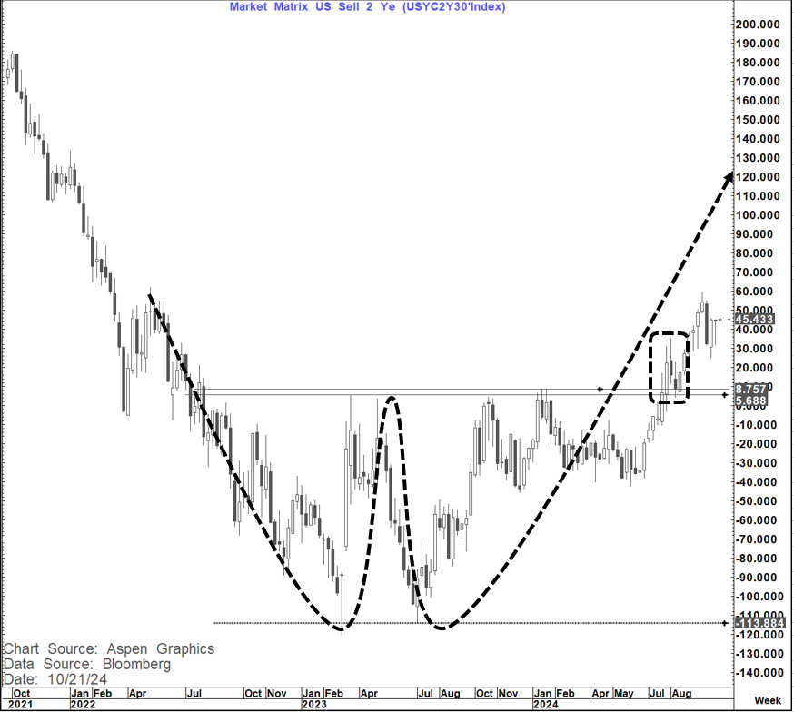
The 2's 30's chart is also very compelling and further gives rise to that caution.
The 2's 30's curve posted a very clear double bottom break (followed by a re-test and then acceleration higher) that targets a move as high as +125 to 130 bp's.
For us to get there IF we are looking at a 30-year yield of 5.75% would suggest a 2-year yield as high as 4.45-4.50% which is only likely if the Fed backs away from the anticipated cuts in the months ahead (or something makes them - like maybe a surge in commodity prices).
If we saw the 30-year yield stopping around the old highs close to 5.2% that would be a 2-year yield similar to today 3.90-3.95%) suggesting only the long-end getting "unhinged"
Either way the suggestion from these charts is that the dynamic and the price action is shifting away at least in the coming months from the 2007 analog and the long end of the curve is very susceptible to a much more material move higher again.
This is still a work in progress, and we know the pivotal levels to watch but concerns have become elevated in that respect