
If there is one thing economists hate more than Technicals it is "TECHamentals" i.e. looking at fundamental indicators from a technical perspective.
This is something I started doing around the GFC and it has served me pretty well, I think.
I do not do it with all fundamental indicators but rather those that "Trend" and have a potential feedback loop to markets. As a consequence, you will not hear me talk about retail sales or capacity utilisation or durable goods orders (look like a cardiogram) as they do not fit those criteria.
You will however hear me talk about inflation data, sentiment indices, housing data employment data etc.
In that respect the charts below look timely and interesting as they are part of the "Employment picture"
Right now, the Fed is not inclined to move further as they have shifted from a primary focus on inflation to employment back to inflation again.
They have made it clear that they would need multiple months of good inflation data to shift that goalpost. However, they have also been at pains to point out that a further softening in the labor market was neither needed or desired to fulfill their dual mandate.
That is simple code for the fact that a deterioration here would be more likely to shift those goalposts more quickly. To their credit they also focus on a much wider set of metrics on the employment side in that respect.
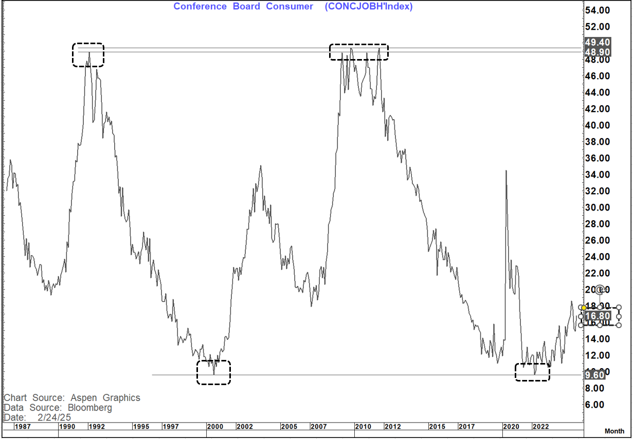
The first chart is the Conference Board - Jobs Hard To Get. This will be updated tomorrow together with the release of consumer confidence.
A couple of things are worth noting here. Firstly, look at the similarity between the major highs of 1992 and 2010-2011 and the major lows of 2000 and 2022 - Almost like a yield curve chart.
Since March 2022 it has been moving up steadily (with corrections along the way). The peak so far was in September 2024- coincidentally the same month the Fed eased 50 bp's as their employment concerns grew and the unemployment rate rose to 4.2%.
After falling for the subsequent 3 months, it popped higher again last month (January). It now sits at levels very similar to 2001.
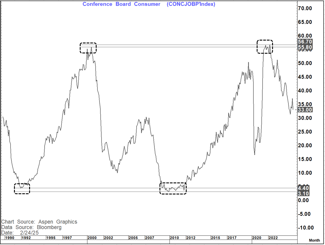
The Jobs Plentiful chart has a very similar picture albeit with a greater level of deterioration. this makes sense as you would expect it to go from plentiful, to less plentiful to hard to get.
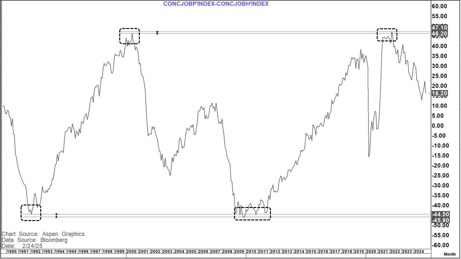
Which brings us to the ratio....
Once again, we have that same symmetrical picture as we have turned off almost identical levels to those seen in 2000.
So why is tomorrow important???
Firstly, there seems to be a good correlation to this ratio and what we subsequently see on JOLTS (Job openings)
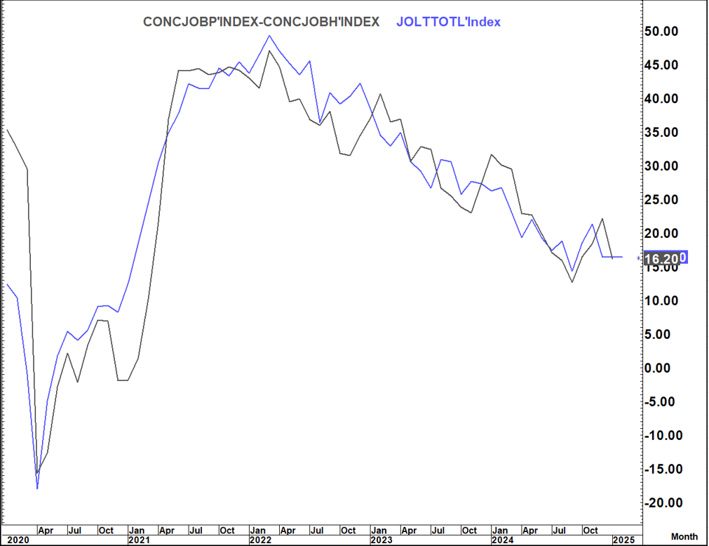
This is something I looked at last month after the fall in the ratio. This suggested that JOLTS could print materially lower than expected (which they did) which then suggested that NFP could miss expectations on the downside (which they did)
I do not know what tomorrow's print on these numbers will be (albeit I am a bit "downside" biased.
2 of the 3 bounces we have previously seen saw at least 2 months of falls thereafter and the one bounce was minimal.
All 3 bounces were ultimately followed by multi-month moves lower (8 months, 9 months and 8 months respectively) before another material bounce. So, the trend looks to be down with the bounces the "head fakes"
However, given the importance of the employment data in the Fed's decision making and given we have employment data on 7th march (JOLTS on 11th) how these numbers print tomorrow could be important in determine what employment data the Fed will be armed with going into the 19th March meeting.
Even if we deteriorate it is unlikely to change their March stance (unless it is very material) but could affect their May "guidance". Absent a deterioration it would suggest a "same old same old" message to be delivered in March.